It doesn’t matter how good your book is if a reader can’t find it — or worse, if they find it and walk right past. You could load your stories into a cannon and fire them across the internet, and still end up with nothing but tattered pages nobody reads.
The cover is your one honest shot. It’s the split-second promise you make to a stranger: this is what kind of story I am, and I think you’ll love it. After some honest reflection on how my covers were performing, I decided it was time to make that promise more clearly.
The Seventh Kill
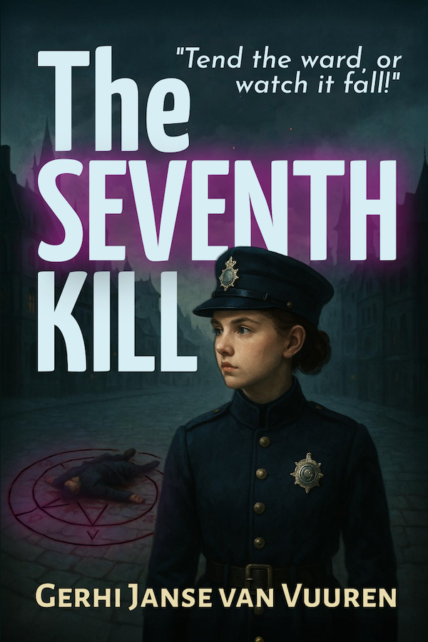
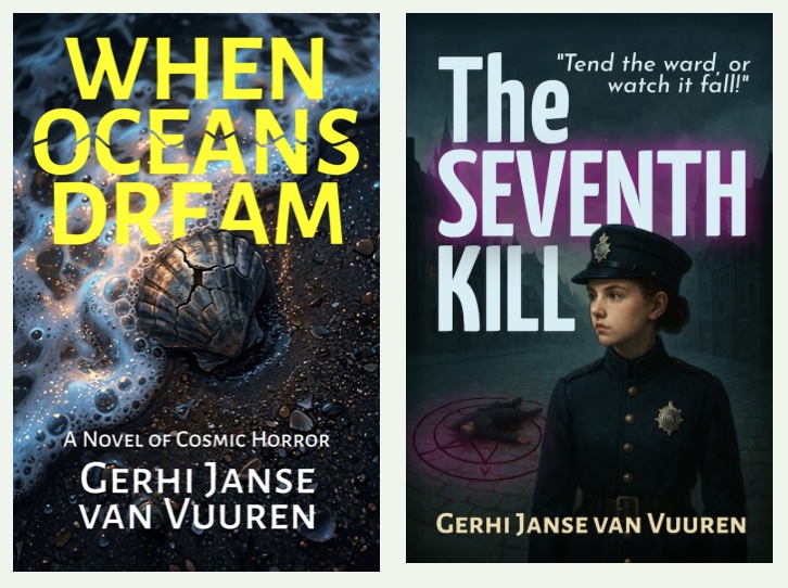
The previous cover told part of the story well: the quasi-historical setting, the female police officer, the unmistakeable shadow of a murder investigation. But it was missing something crucial — the fantasy of The Seventh Kill.
Readers browsing historical mystery shelves might have picked it up and been surprised to find magic woven through every chapter. Fantasy readers, meanwhile, had no signal that this was their kind of book at all.
The fix was surgical rather than a full overhaul. A subtle purple glow now bleeds into the scene — the kind of light that has no rational source. It’s a whisper rather than a shout, which feels right for a story where the supernatural lurks at the edges of a world that still wants to believe in logic and procedure.
That glow is an invitation. It tells the fantasy reader: yes, there is magic here — and it tells the mystery reader: this murder has layers you haven’t imagined yet.
When Oceans Dream
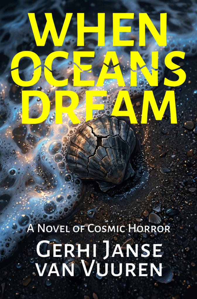
This one needed more than a glow. The first cover had ambition — it was edgy, layered, deliberately graphic. But it was sending the wrong signals entirely. Readers were unsure whether they were looking at a children’s picture book or a niche art project. Neither is what the story is.
When Oceans Dream is cosmic horror. It should feel like standing at the ocean’s edge at 3 a.m. and realising the water is watching you back.
The new cover strips everything back to a single, arresting image: a cracked shell on a dark shore, touched by luminous, unsettling foam. It’s beautiful and wrong in equal measure. The typography is bold — almost aggressive. No decorative frames, no collage layers, no mixed signals. Just the ocean, a relic, and the creeping sense that something vast is dreaming beneath it all.
The subtitle, A Novel of Cosmic Horror, does the rest plainly, for readers who know exactly what they’re looking for.
Covers are hypotheses. You make your best guess about what speaks to a reader, you put it out into the world, and then you watch. I’m genuinely curious whether these new covers find the readers these stories were always meant for.
Let’s see what readers think.